How Visual Analytics Can Boost Health System Revenue

By Rochell Pierce, senior vice president of market development, Aegis Health Group
In healthcare, the term Big Data doesn’t really capture the immensity of information being gathered and shared. For example, the HCA enterprise data warehouse now contains more than 28 petabytes of data. That’s 28 million gigabytes of data — and that’s just for one health system.
The challenge is to transform Big Data into Smart Data, where strategic planners and marketing teams can quickly find actionable information to boost the bottom line. That’s why health systems are beginning to use intelligence tools that harness the power of geospatial technology and sophisticated mapping for faster, more informed decision-making. But there’s a wide disparity in what these systems can deliver — and some are exorbitantly priced.
Following are some guidelines for assessing these analytic tools that offer a visual roadmap for seizing new opportunities and improving things like physician alignment and referral performance.
- Size and scope of the dataset — An analytic tool should gather data from at least 85 percent of the healthcare market, not an easy feat. That means it should encompass not just Medicare and Medicaid, but major commercial payers like United Healthcare and Aetna. The analytic product should be able to draw on a vast amount of claims data, then turn that information into easy-to-understand visual summaries.
- Powerful graphical interface — An analytic tool should be able to turn complex data (physician referral activity, patient flow, physician coding patterns, demographic shifts) into easy-to-grasp maps and visuals.
- Simplicity — Some analytic products promise ease of use, yet require the user to be familiar with SQL and other report-building tools. It’s important to find a graphical interface that makes it simple to visualize an entire market at a glance. Ideally, there should be no need to hire a full-time employee to build and manage reports.
- Versatility — An analytic tool should achieve multiple goals, like increasing revenue, managing risk, and improving physician alignment. The tool should also offer at-a-glance summaries of things like specialty flow, physician loyalty, and patient retention.
- Affordability — A health system should be able to acquire or license an analytic tool without paying the sky-high prices only the IRS or NASA can afford.
- Consultative capabilities — Every analytic tool should be backed by a consultative team that can help a health system harness the technology’s full potential. Simply giving hospital executives a password and wishing them good luck is not a recipe for success.
Analysis Made Easy
Here are some examples of how a visual analytic tool can simplify strategic planning while increasing revenue.
[Butterfly flow map]
Caption:
Butterfly Flow — This map visually tracks the distribution of shared visits in both pre-acute and post-acute care.
[Specialty flow map]
Caption:
Specialty Flow — Shows the flow of visits from primary care to specialists and prioritizes relationships in order of critical success factors.
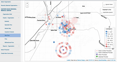
[Hospital geo flow map]
Caption:
Hospital Geo Flow — Incorporates web-mapping to help visualize a physician’s patient relationships in a spatial manner.
Worth A Thousand Words
Visual analytic tools can streamline decision-making and increase hospital revenue, but some have far greater capabilities and offer better pricing. Using the criteria above, hospital strategic planning and marketing teams can find the visual analytic tool that best meets their needs.
About The Author
Rochell Pierce is senior vice president of market development at Aegis Health Group in Brentwood, Tn.
